The Typography of Alterra
Friday, November 13, 2020 at 3:21am
This past October 2, I silently released the updated edition of my third novel, Alterra. This was an important novel for my development as a writer. Social, ethical, and philosophical themes, which stir beneath the surface of an adventure story in my first two novels, are, in Alterra, front and center, taking priority over the movement of the plot. This novel also marked the first time I had forced myself to learn concision. Instead of letting my big ideas sprawl to 80 or 100,000 words, I made it a goal to show all of my grand vision in no more than 45,000 words (40,000 is the minimum word count for a novel). The exercise was enormously educational and set the stage for me to add the short story and flash fiction formats to my writer’s toolbox a year later.
On top of all that, Alterra would provide the foundation and background history for my novel The Other, which I wrote in 2019 and published earlier this year.
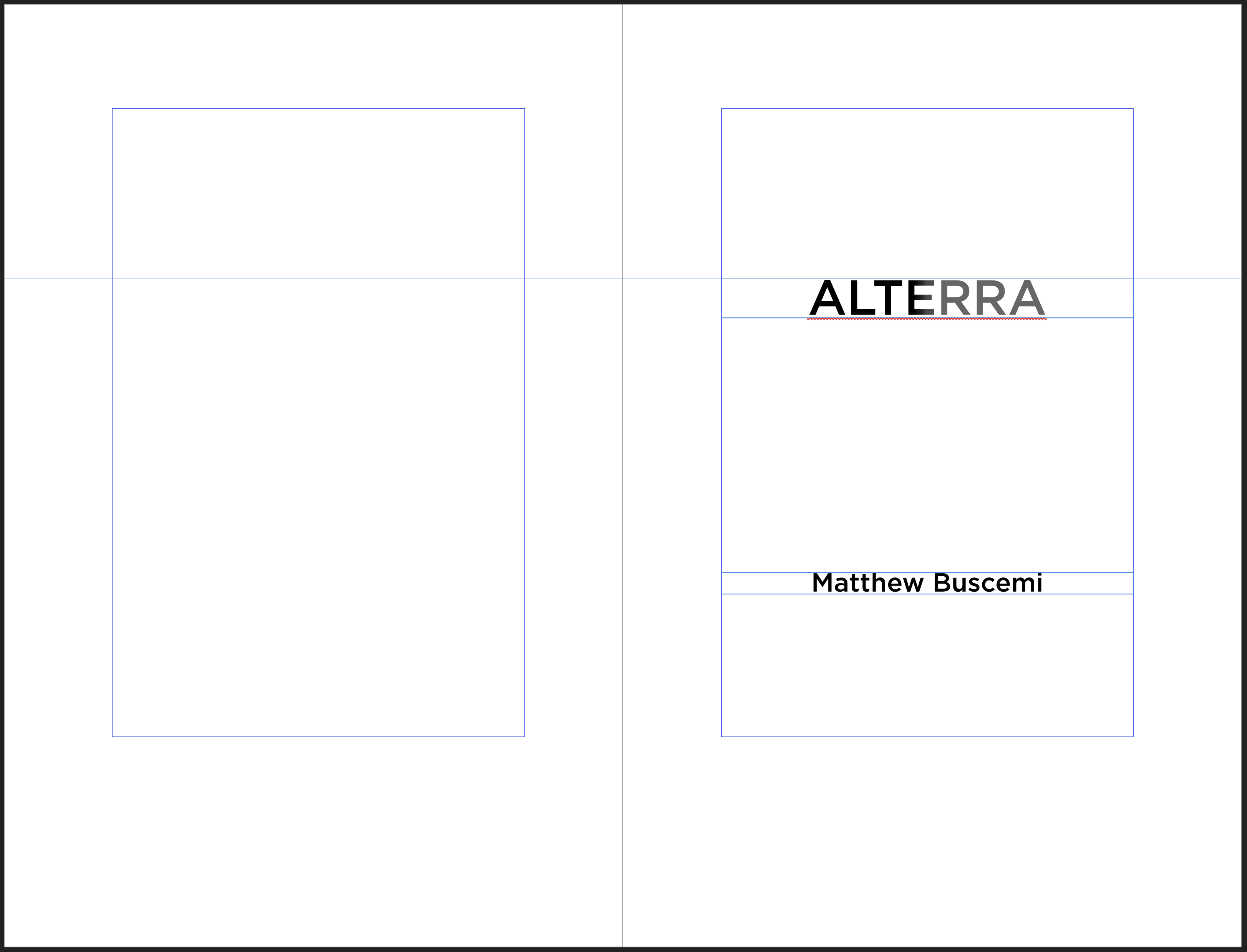
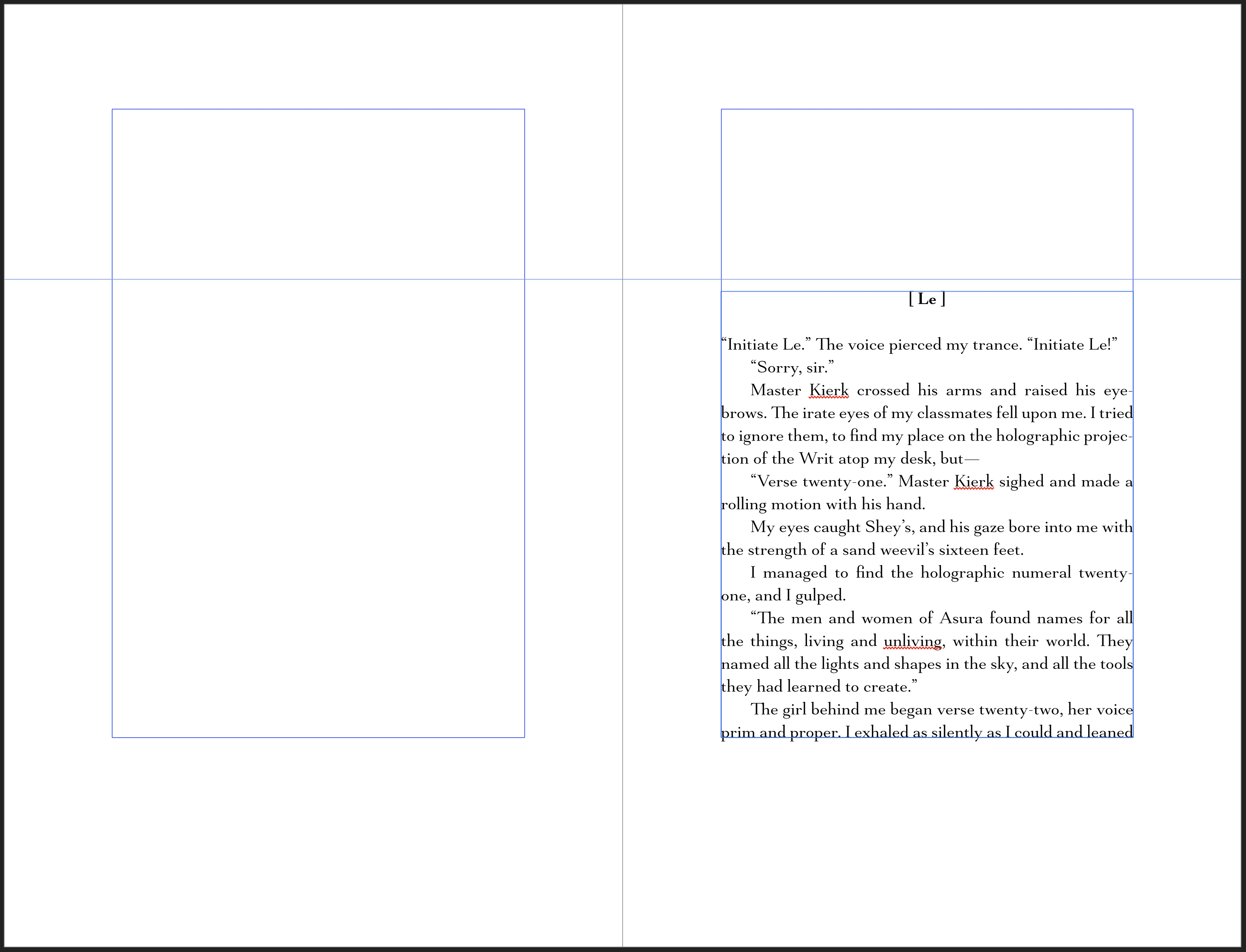
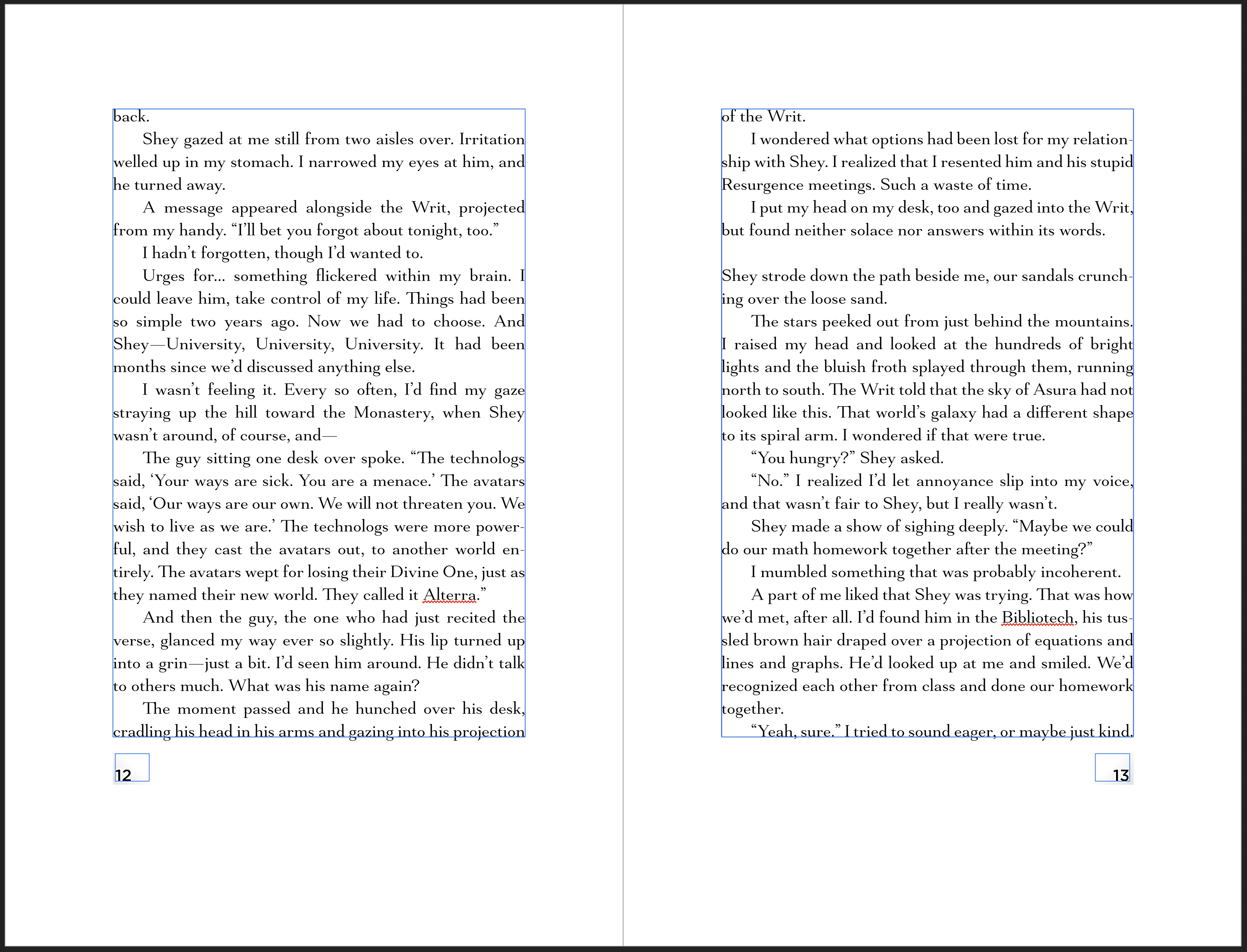
First, the stuff I liked. I chose Mantonico for the text font, which I think is a good choice for this novel and much, much more legible than the text font I chose for this novel’s first edition in 2014. And, of course, I have utilized the van de Graaf Canon here as well to great effect. I think the text layout will present the best reading experience yet for this novel.
Now for the challenges.
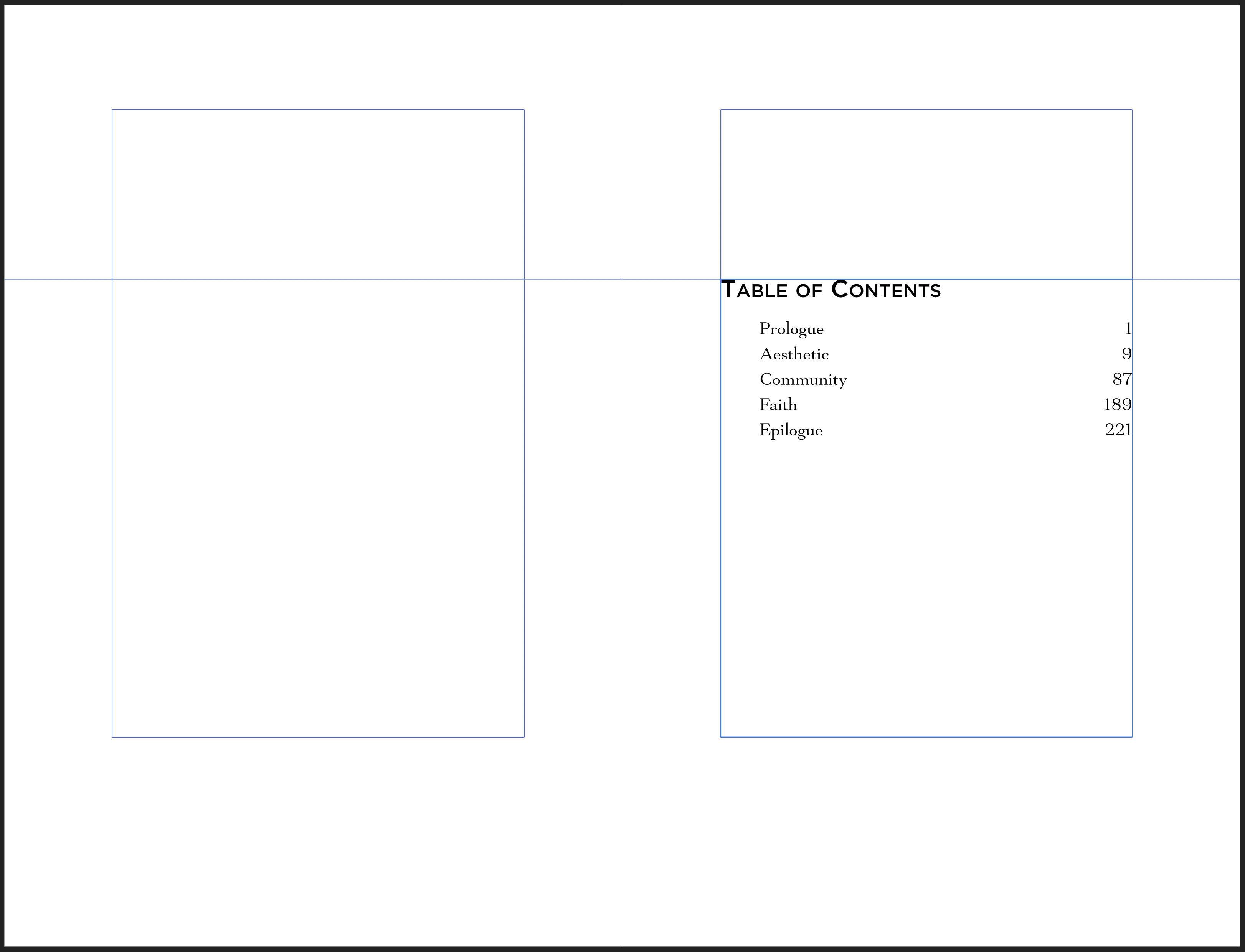
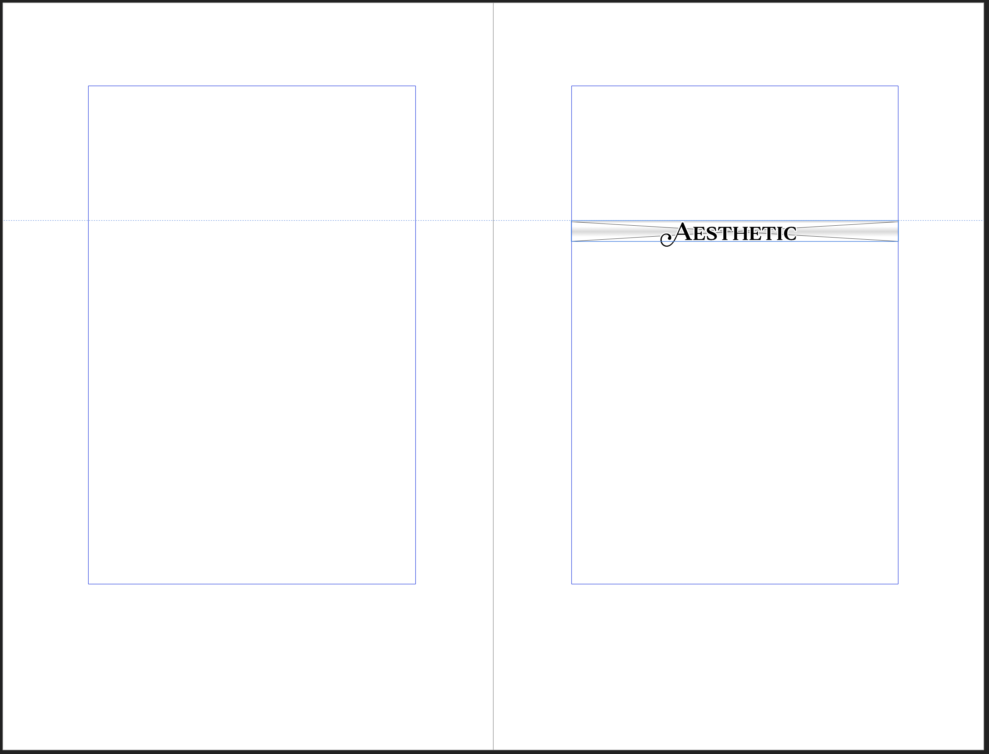
The most glaring issue is the display font. I stubbornly dug in my heels at the beginning of this project and wanted to match the cover’s use of Gotham. But Gotham and Mantonico decidedly clash. In the end, I had to limit Gotham to being my display font only on the half title, title, and table of contents. That was fine. Mantonico had some nice swashes for the section headers, anyway. But, if I were starting this project over again, I would ditch Gotham and find something more complimentary to Mantonico.
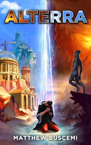
There’s also the fact that I wanted to capture something of cover’s aspect of “two worlds,” Alterra and Asura, which are pictured on the cover on either side of Le Namgyal. I tried a lot of different effects in order to make this work, but in the end I had to settle for choices that merely “weren’t that bad”: the black/grey fade in the title, the dual linear blur behind the section headers, and the equilateral triangle blur behind the page numbers. These are acceptable to me, but I wish I could have found something that would have worked out better.
And finally, there’s the fact that Alterra, as a text, is, quite frankly, a pain in the ass to lay out. The numerous scene breaks are tedious to track down and make sure are formatted correctly against page breaks. The text contains numerous formatting oddities: faux biblical passages, text messages, emails, computer readouts, and other such paraphernalia must be rigorously searched out, and an enormous number of text styles must be maintained to handle them all. Unfortunately, there’s no one to blame for these issues but myself, as I am also the author.
Despite the above issues, this is still the best and most elegant edition of Alterra yet to grace shelves. I’m proud of it, I learned a ton, and I look forward to hitting closer to the mark next time. Even if it means reformatting all those emails… again.