The Typography of Schrödinger’s City
Thursday, July 30, 2020 at 2:25am
Six years ago, I set out to become a publisher. To my mind, that did not mean finding the simplest path to monetizing my writing. Rather, like most endeavors I set my mind to, I took on a responsibility to myself to achieve excellence. One sub-discipline I found myself gravitating toward was that of book typography, the act of designing and laying out the interior of a book.
In hindsight, it does not surprise me that this was an area I latched onto. Across a wide swath of my activities, I find myself gravitating toward highly detailed, complex domains. There’s my career (software engineering), video games (RPG, 4X strategy, and explore/craft genres), and even my physical fitness endeavors (swimming, weight lifting, and, most recently, boxing, all of which are technical sports in that they require extreme attention to detail in how one executes movements).
In terms of sensitivity to form and function, book typography is on par with software engineering, a fact that will probably surprise my fellow software engineers. By way of example, just as there are bits within any given application that one could flip, which would brick the machine running it, there are elements on the page of a book which, if moved a quarter of a centimeter, will change a reasonably readable page into a hideous, distracting monstrosity.
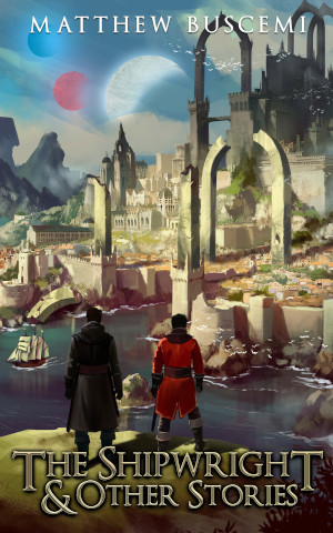
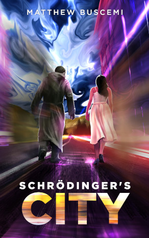
The result is that, of all the domains of publishing, typography is the one I have given the most attention. Since it has been some time since I discussed that on my blog, I’ve decided to run a series on the designs of the new editions of my books as they are released. In this post, I’ll be talking about the new edition of Schrödinger’s City, due to be released this Saturday, August 1 on the fifth anniversary of its original publication.
The canon is essentially a geometric way of arriving a text block that has three really cool properties.
- The width/height of the text block is the same ratio as the width/height of the page.
- The height of the text block is the same length as the width of the page.
- If the ratio of the width/height of the page is 2:3, then the inner-top-right-bottom margin ratios will be 2:3:4:6.
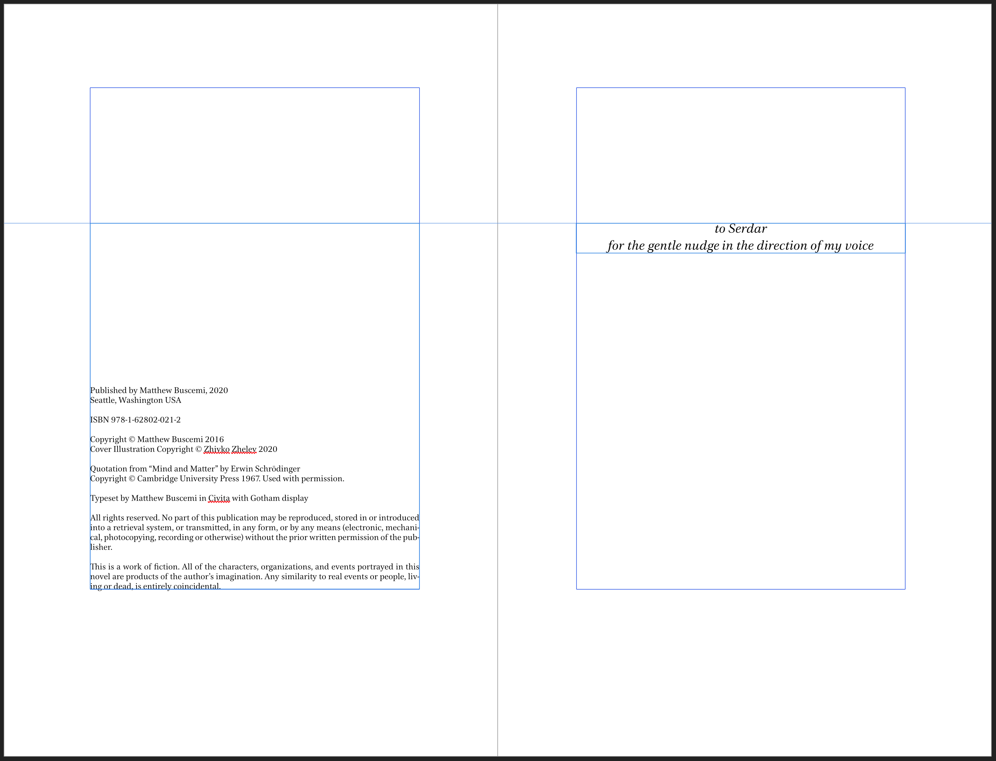
Now, my designs don’t perfectly match the canon. One of the important principles of typography is that the math doesn’t matter if the book isn’t functionally readable. Software engineers will find common ground here. It doesn’t matter how beautiful your code is if it causes errors in production.
In my designs, you will find the inner and outer margins are actually much closer to 2:2 than 2:4. This is because the canon was designed for books that have a sewn binding, meaning that a reader would be able to open the book to any page and the book would lie flat. The reader would be able to see the whole spread. However, my books are paperbacks with a glue binding. This means that most of the inner margin “rolls inward” toward the spine. It definitely doesn’t lie flat when opened, not without damage, anyway.
For these page layouts, I started with the canon, then moved each text block toward its outer edge. In essence, I’m trying to simulate the look of the canon when you hold the book open at any given point by factoring in the roll of the spine.
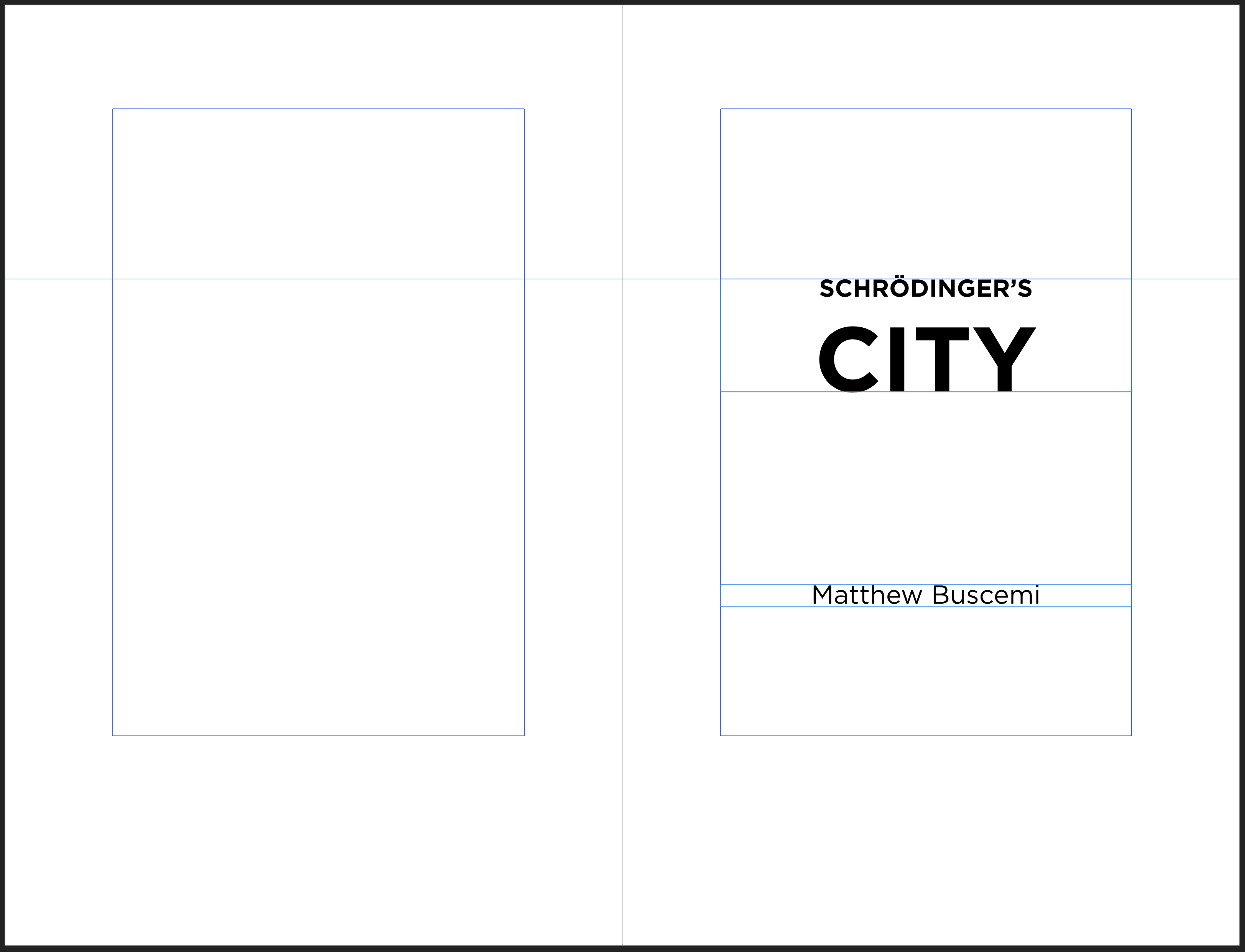
Next, there’s font choice. Back in 2016, I had a one-of-a-kind edition of Our Algrorithm Who Art Perfection designed and printed for Alex, and at that time I was already planning a similar edition of Schrödinger’s City for 2017. However, late in 2016, I decided to refocus my efforts on paying down debt, and the one-of-a-kind Schrödinger’s City project evaporated, but not before I found a really nifty looking text font, whose name draws a nice affinity to the book: Civita.
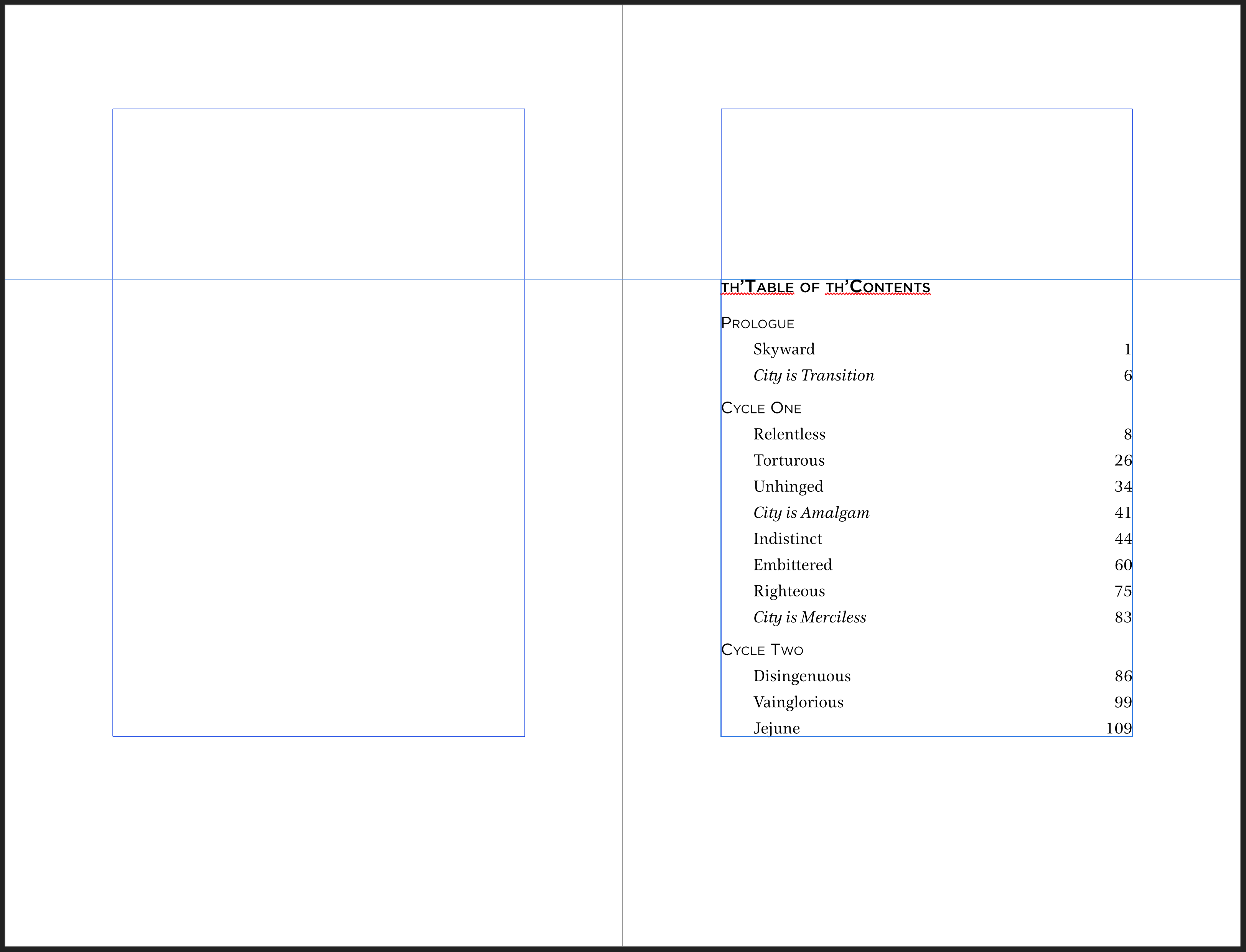
For the 2019 editions of my work, I decided to normalize all my books to a single font, but with the 2020 editions, I’m doing individualized designs again. After four long years, I can finally put Civita to use, and I’m happy with how it turned out alongside the book’s display font, Gotham, which Zhivko Zhelev introduced me to as part of designing the cover. You can see it most prominently on the title page and the table of contents headers.
In all previous layouts, I put the sub-headers in double parentheses, e.g. “( ( before ) )” and the City sections simply had an empty set of double parentheses. I made the outer set a larger font size for a kind of amplification effect. This has worked well in the past, but I wanted to try something new this time around. I had the idea to use a radial gradient in an oval and set the text in white on top of it. For the City chapters, I turned the gradient into a kind of fuzzy halo. I’m happy with how this turned out, both visually and thematically, with the boundaries of the sub-header words indeterminate, though the text is still legible.
The new design represents a nice update to the text, and I’m excited to put it out into the world this coming Saturday.